Thursday, June 6, 2013
Wednesday, May 22, 2013
Map revision
Wednesday, May 15, 2013
one hour speed paint #2
Tuesday, May 14, 2013
one hour speedpaint
 |
| detail. |
Wednesday, May 8, 2013
Anwyn- a map for a friend
Here is a first draft WIP of a map I am making for a friend of mine. He will use it to enhance his D&D game. I said I would do this for him about 5 years ago, and yes, I am just getting to it. I have no excuse.
 |
| I will be reviewing it with him today, getting feedback, and making the necessary alterations based on our discussion. |
Sunday, May 5, 2013
Nod rule set first print
 |
| Here is a quick example of a draft of a layout detailing one of the missions in the book. |
 |
| Sneak peek of some of the deployment zones for an included campaign. There is also a first look at an old world map of Nod, though much of this has changed at this point. |
 |
| A first draft of some fluff in a page layout. |
 |
| Some early art for one of the models in the book. It has been used for the character page above. |
Wednesday, May 1, 2013
The printed pieces have arrived!
 |
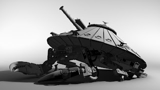
| Laying out the pieces. Everything is here except the head. The head will be given a slightly thicker barrel on the gun , and the second prototype will also feature a thicker cannon. |
Tuesday, April 30, 2013
3D printed pieces finally done!
Quick update!
The 3D pieces are finally done.
Moddeler.com was a joy to work with, and I cannot wait to pick them up tomorrow morning and start assembling this thing right away!
The 3D pieces are finally done.
Moddeler.com was a joy to work with, and I cannot wait to pick them up tomorrow morning and start assembling this thing right away!
Here is a quick shot of an earlier work in progress, before texture and other touches were completed.
Monday, March 4, 2013
model WIP update
 |
| Here is one page of designs and details. There are many, many more. |
 |
| Here are some details of legs and the claw, much earlier in the modeling process. |
Saturday, February 23, 2013
Completed table.
 |
| Close up of the bridge, the brackish water and some flock. I like the reflection on the water in this one, but hate that I can see places I missed with flock. Oh well, save it for the next table. |
 |
| One more close up to compare with the earlier WIP from the last post. |
Wednesday, February 20, 2013
Game board design/ fabrication WIP's
So, taking the most successful design from the previous post, the next step is making the full sized board. The board is 3'x 3' and will be used for game testing and display. It is pretty rough at this point but it is getting there I am not completely happy with some of my transitions, but my budget was very limited for this project- I used mostly found objects and old paint to get this to where it is now.
 The first step is quickly constructing the quay-side terrain out of old pieces of 1' thick polystyrene Its pretty poor construction material, but it gets the job done and keeps the board light. Its glued to a piece of door skin to keep it rigid.
More surface texture... sand. An old diorama trick. It fills in the gaps between rocks and the surface. It looks good painted, too.
After sealing the entire thing a fast coat of spray paint lays in the first pass of color. his is very quick as tightening up happens later with a brush.
Second pass of paint. Glazes and then dry brushing. Glazes bring all of the colors together, and makes the garish colors a bit more subdued. Dry brushing helps to pop out some of the surface details like the rocks and the sand.
Quick detail shot. I am really looking forward to the finishing touches to complete this piece. If I get extra time I will glue black felt around the edges to clean them up. I am shooting for the whole thing to come in around 8-10 hours, depending on cleaning up the sides.
I'll get the final pictures up as soon as its done this weekend.
Monday, February 18, 2013
Game board designs
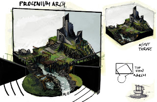
These are some game board designs I just did for a project I am working on. The top can be converted to be a set design, with an optional thrust section for actors to perform in the round. All done in Photoshop.
Portrait on a shield
This was a shield I painted for a Christmas gift exchange with old friends from the SJSU A/I graduating class of 2012. It is a white elephant style deal, and I drew Paul Yula! The theme was crow (corvus in latin), so I went for the literal approach, and stuck his head on one.
Here is a detail. Its acrylic on aluminum. I am currently trying to get better pictures, these ones reflected too much flash, washing out the blacks. I printed out font from PS and made a stencil for the lettering. If I remember correctly the shield was about 19'' on each edge.
Sunday, February 10, 2013
1st project WIP for a class led by the legendary Barron Storey
The project is meant to teach us to communicate through our work. We use a process for generating images called "bits". This has us creating many smaller works of art and compiling them into one composition later, allowing us the chance to focus on every item individually. He stresses that we use different media and push our comfort level. I gave it a strong effort, even moving with a concept I hated, but keeping it as it was the first thing that sprang to mind.
 |
| These are icons I made to glue into the collage on the final piece. |
 |
| This is my 2nd rough draft. I chose to use this composition and move to a final. This is 14.5x 9'' on illustration board. |
Subscribe to:
Posts (Atom)


